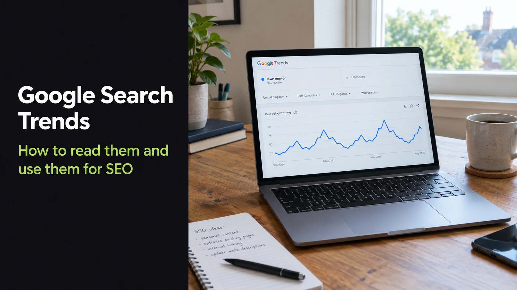
Most people open Google Trends, watch a line climb to 100, and read it as “lots of people search this.” That reading is wrong more often than it is right, and I see it lead to bad content calendars, wasted refreshes and panicked reactions to traffic drops that were never ranking problems in the first place.
Here is a quick example of why the data matters. The phrase “google search trends” averages about 27,100 searches a month in the US, yet over the last 12 months it swung from 33,100 in February and March 2026 down to 18,100 from June to August 2026 (DataForSEO, US data). Same keyword, nearly double the demand depending on the month. If you publish or refresh at the wrong time, you miss most of that window.
In this guide I will show you what Google search trends actually measure, how to read the 0 to 100 score without fooling yourself, and the five ways I use Trends data in real SEO work for my clients.
What Google search trends actually show you
Google describes Trends as a random sample of aggregated, anonymized and categorized Google and YouTube searches. That one sentence explains most of what people get wrong.
It is a sample, not the full search log. Google says a sample is enough because it handles billions of searches per day, but it also means very small keywords can look jumpy or show no data at all.
It is relative interest, not search volume. Trends never tells you “1,200 people searched this.” It tells you how popular a term was compared to everything else people searched in that place and time.
It comes from two separate datasets. According to the Google Trends data FAQ, real-time data is a sample covering the last seven days, while non-realtime data goes back to 2004 and stops 72 hours before your search. That is why a “past 7 days” chart and a “past 12 months” chart for the same term will not always line up.
Where to see Google search trends
There are three places I use, and each answers a different question.
Explore is where the real analysis happens. You enter a term or topic, pick a location, date range, category and search type (web, image, news, shopping or YouTube), and get interest over time, interest by region, related topics and related queries.
Trending Now shows what is spiking right now. Google rebuilt it in August 2024 around a new forecasting engine that, according to Google’s announcement, detects 10 times as many emerging trends as before and refreshes about every 10 minutes. It now covers 125 countries, and 40 of them can be broken down by region. You can filter by the past 4 hours, 24 hours, 48 hours or 7 days, and you can hide trends that have already cooled off.
Year in Search is Google’s annual roundup of the biggest searches by country and category. It is great for big-picture context and content ideas, less useful for day-to-day keyword decisions.
If a client asks me “what are people searching right now,” I go to Trending Now. If they ask “should we write about this,” I go to Explore.
How to read the 0 to 100 score without fooling yourself
Google’s FAQ explains that each data point is divided by the total searches in that time and place, and the results are then scaled from 0 to 100 based on the topic’s share of all searches. In plain terms:
- 100 is the highest point that term reached inside the chart you are looking at.
- 50 means half as popular as that peak.
- 0 usually means there was not enough data, not that nobody searched.
Three rules keep me from misreading it.
The scale resets every time you change the chart. Switch from “past 12 months” to “past 5 years” and a peak that was 100 might become 40, because a bigger peak now sits inside the window. The numbers only mean something inside one chart.
Compare terms in the same chart, not across charts. If you put two keywords in one Explore view, they share one scale and you can compare them fairly. Two separate screenshots, each with its own 100, tell you nothing about which is bigger.
Use topics when the meaning matters. A search term only counts that exact wording. A topic groups related searches, including misspellings and other languages. For ambiguous words, add a category filter so “jaguar” the car does not mix with jaguar the animal.
5 ways I use Google search trends for SEO
Google’s own documentation says Trends can help you decide not only what to write, but when to publish it. These are the workflows I actually run.
1. Time content around seasonal peaks
Look at the past 5 years for your main keyword and find the months that peak every year, not just once. Then publish new content or refresh existing pages 6 to 8 weeks before that peak, so Google has time to crawl and settle rankings before demand arrives.
The keyword “google trends” is a good example. In the US it hit about 550,000 monthly searches in February and March 2026 and fell to about 246,000 from June to August 2026 (DataForSEO). Anyone targeting that topic should have their page in its best shape by January, not in March.
2. Spot rising queries before keyword tools catch up
In Explore, scroll to related queries and switch from “Top” to “Rising.” Top shows what is consistently popular. Rising shows what has grown fastest recently, and anything labeled “Breakout” has grown so sharply that Google stops giving it a percentage.
Third-party keyword tools often show zero or tiny volume for these terms because their data lags. That gap is your opportunity to publish first.
3. Choose between keyword variants
When I am unsure whether an audience says “SEO audit” or “website audit,” I put both in one Explore chart for the target country. The one that consistently sits higher wins the H1 and title, and the other becomes a natural secondary phrase in the body. It is one of the quickest ways I settle wording debates with clients.
4. Find where demand is strongest
The interest by region map shows which states, regions or cities search a term most, relative to their total search activity. I use it to decide which location pages deserve to be built first and which areas to mention in service pages. Remember it is proportional, so a small state can top the list even if a large one has more total searches.
5. Tell a demand drop from a ranking drop
This is the one that saves clients the most stress. When organic traffic falls, I open Search Console and Google Trends side by side for the main keywords. If Trends interest dropped by a similar amount over the same period, the market shrank and your rankings are probably fine. If interest held steady while your clicks fell, you have a visibility problem to fix.
Google itself recommends this check when debugging traffic drops. If the data points to a ranking problem, my SEO recovery service and this technical SEO audit checklist are where I would start.
What Google search trends can’t tell you
Trends is one of the most useful free tools in SEO, but it has real limits, and Google is upfront about them.
It does not give search volume. You get relative interest only, so you still need a keyword tool or Google Keyword Planner to size an opportunity.
Small keywords get noisy. Because the data is a sample, low-volume terms can show zeros, sudden spikes or slightly different numbers when you pull the same chart a week later.
It is not a poll. Google’s FAQ states plainly that Trends is not a scientific poll and should be treated as one data point among others before drawing conclusions.
Some searches are filtered out. Google removes certain searches, such as duplicate searches from the same person over a short period, so it is not a perfect mirror of every query typed.
My rule: Trends tells you the shape and timing of demand. Keyword tools tell you the size. Search Console tells you what your own site is actually getting. You need all three.
Google Trends vs other keyword tools
| Tool | What it shows | Absolute search volume? | Best for | Price |
|---|---|---|---|---|
| Google Trends | Relative interest 0 to 100, regions, rising queries | No | Seasonality, timing, comparing terms | Free |
| Google Keyword Planner | Search volume ranges, bid estimates | Ranges (exact figures with active ad spend) | Sizing paid and organic demand | Free with a Google Ads account |
| Google Search Console | Your own clicks, impressions, positions | Your site’s impressions only | Diagnosing your own traffic | Free |
| Semrush / Ahrefs | Estimated volume, difficulty, competitor data | Yes (estimates) | Full keyword and competitor research | Paid plans |
| Glimpse (browser extension) | Adds estimated volume on top of Trends charts | Yes (estimates) | Turning Trends charts into numbers | Free tier plus paid plans |
Note: verify current pricing on each tool’s website before publishing, as plans change often.
My quick Google Trends routine
When I start keyword research for a new page, this takes me about 10 minutes:
- Enter the main keyword as a topic in Explore, set the target country and “past 5 years.”
- Note the months that peak every year and plan the publish or refresh date 6 to 8 weeks earlier.
- Add up to four variants to the same chart and pick the strongest wording for the title.
- Check Rising related queries for subtopics to cover as H2s or FAQs.
- Check interest by region if the page has any location angle.
- Pull search volume from a keyword tool so the plan has real numbers behind it.
If you are also working on site performance, my breakdown of what actually affects rankings in Core Web Vitals pairs well with this.
Frequently asked questions
How can I see Google search trends?
Go to trends.google.com. Use Explore to look up any term or topic by location and date range, or open Trending Now to see what is spiking in the past 4 hours to 7 days. It is free and works without signing in.
What does 100 mean on Google Trends?
100 is the highest point of interest for that term within the specific chart you are viewing, based on your chosen location, date range and search type. 50 means half that peak. It is a relative score, not a count of searches.
Is Google Trends free to use?
Yes. Google Trends is completely free, and you can also download chart data as a CSV file for your own analysis.
How far back does Google Trends data go?
Non-realtime data goes back to 2004 and runs up to 72 hours before your search. Real-time data covers the last seven days and comes from a separate sample.
What are the disadvantages of using Google Trends?
It shows relative interest instead of search volume, small keywords can be noisy because it uses a sample, and the scale changes every time you adjust the chart. It works best alongside a keyword tool and Google Search Console.
Is there an alternative to Google Trends?
For search volume, Google Keyword Planner, Semrush and Ahrefs are the usual choices. Glimpse is a browser extension that adds estimated volume on top of Trends charts. None of them replaces Trends for spotting seasonality and real-time spikes, since that data comes straight from Google.
What is the most searched thing on Google right now?
It changes constantly. Trending Now shows the current top rising searches for your country, refreshed about every 10 minutes. For the biggest searches of a whole year, check Google’s Year in Search.
Muhammad delivered excellent work on this SEO and optimization project, and I truly enjoyed working with him. Over the course of our 8-month collaboration, his strategies led to over 400% increase in customer leads – helping us outperform even larger competitors in our saturated industry. I highly recommend Muhammad, and will absolutely work with him on other projects too when they will come out.
Alessio Ligabue, Services Provider (Italy)
Want help turning search trends into traffic?
Knowing when demand rises is only half the job. The other half is making sure your pages are technically sound and ready to rank before it does. I help businesses plan content around real demand and fix the issues that keep good pages from ranking.
Book a free strategy call and we will look at your keywords, your timing and what is holding your traffic back. Or see how I approach technical SEO consulting.